Written by Erin Whittaker, English and Creative Writing
The usability testing activity I completed during the Student Learning Ambassadors project prompted me to write my blog post on the ease and accessibility of finding specific information covered in lectures and seminars based on the chronological layout and labelling of their files. Having navigated my way through two previously unseen exemplar modules and another of a module I took in 2nd year, I found that the module layouts that were most accessible and easy to navigate were those in which the information and materials for lectures and seminars were labelled by week and topic title, rather than simply the number of that specific seminar; ie. ‘Seminar: Week 2 – Learning about Specificity’ > ‘Seminar 2’. Labelling the files in this way made finding the information covered in those specific seminars and lectures straightforward and less time consuming than having to trawl through multiple seminar PowerPoints in order to find the specific information I was seeking.
Additionally, the most obvious folder for storing both the lecture and seminar Panopto recordings and accompanying PowerPoint slides would be, in my opinion, ‘Learning Materials’, along with additional materials such as the Aspire Reading List, workshops, tutorials, and schedule overview for that module. However, it would be my recommendation that if the files for seminars and lectures are plentiful in number, ie. more than three files per week, that they are given a separate folder under the title of ‘Lectures/Seminars’ within the left-hand folder column, along with a copy of the Aspire Reading List.
Written by Katie Henslowe, Psychology
When I started my first year at Aberystwyth University, one of the first presentations I had was how to use Blackboard. However, I came out feeling more confused than when I went in! So, I went back to my dorm and decided to explore the page. Logging in and selecting a module was fine. However, it took quite a bit of exploring to get used to the layout and took a while to gauge what tasks needed completing. Finding the module handbook and staff contact details was especially difficult, but I struggled the most with consistency. Each module had a different layout and that was confusing, as materials took time to find. As a first-year, I found the process quite overwhelming!
Being in my third year now, I am used to using Blackboard. Therefore, being a student Learning Ambassador has been a very valuable experience and a great opportunity to provide my views on Blackboard navigation. During the usability testing activity, I completed as part of the Student Learning Ambassadors project, I reviewed two modules, neither of which was from my department. I was surprised by how different the layout and learning materials looked. Having week 1 at the bottom of the page was definitely something I wasn’t used to. The materials for lectures and seminars were relatively easy to find but the module handbook, module coordinator contact details and mark scheme were difficult to find, which I found frustrating. My advice would be to make Blackboard clear and easy to navigate. This could be achieved by being consistent with the materials, perhaps adopting a standard layout for each module, so students can find the correct information with minimal stress.
Written by Charlotte Coleman, School of Education
After studying at Aberystwyth University for three years it is fair to say that I have experienced my fair share of issues with Blackboard as I’m sure many other students have. Before participating in the project, I hadn’t realised the differences between module layouts across different departments at the University. After participating in the Blackboard user testing activity, I noticed many differences but the most obvious to me was how to access weekly content. From my experience, all my modules have had separate folders within the ‘Learning Materials’ section where each week’s content has been stored. I have found this very helpful in allowing me to remain organised as within each week’s folder, all tasks, and materials relevant to that week have been easy to access. During the user testing activity, I found that some modules were more difficult to navigate and the reason for that was because of the way the content was organised.
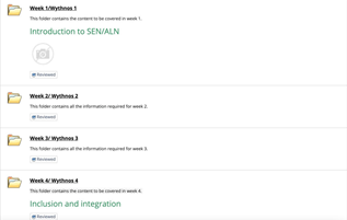
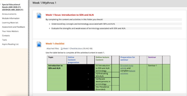
My one tip on Blackboard module design would be to take time in organising weekly content and have a separate folder for each week or topic. From my experience is saves a lot of time and it ensures that everything for each week is completed on time. Below are some examples from one of my third-year modules that made use of organising materials in this way. The layout for the module also included the review button, this meant that once everything had been completed and the button was ticked, the materials for the following week would appear. Again, from a student’s perspective, this is very useful for staying organised.


